Setting your site-wide colors, fonts and spacing (Theme)
The Design tab shows your shop's colors and fonts (set in Settings › Brand) and holds the button style, section style, spacing and background images your whole site shares.
Where to find it
Website (left sidebar) → Design tab (in the left panel)
Your theme is the set of colors, fonts and spacing that every section on your site uses by default. Change a color here and it updates everywhere that color is used, instead of editing each section one at a time.
Where to find it
Click Website in the left sidebar, then the Design tab in the left panel (next to Sections and Pages).
Your colors and fonts are set in Settings › Brand, not here. The Design tab only shows them. Everything else on this tab (button style, widget style, spacing and background images) is a draft that goes live on every page when you publish any page from the top bar. Your Brand colors and fonts reach the live site at that same moment. See Pages, templates and publishing in the Site Builder.
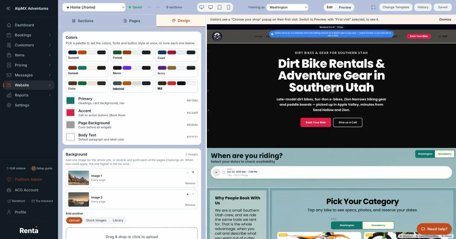 The Design tab showing the shop's seven colors and two fonts read-only, with the link to Settings › Brand
How it works
- Colors — seven swatches that you can read but not change here. They use the same names as the Brand page, each with its color code beside it: Headings and navigation, Buttons, Highlights, Page background, Cards and panels, Body text and Quiet text. A blue note says "Set in Settings › Brand and applied to your website when you publish", with a Change in Settings › Brand link. Set the colors there; see Your logo, brand colors, and fonts.
- Headings and navigation — headings and the navigation bar.
- Buttons — your main buttons, such as Book Now.
- Highlights — small highlights and badges, never your main buttons.
- Page background — the color behind everything on a page.
- Cards and panels — cards and panels that sit on top of the page background.
- Body text — paragraphs and labels.
- Quiet text — captions, dates and helper lines.
If the body text or the headings are hard to read on the page background, a warning starts with "Low contrast (WCAG AA):".
- Fonts — Heading Font and Body Font, shown as read-only boxes in the font itself, with the same Change in Settings › Brand link. "Site-wide default. Individual widgets can override."
- Button Style — Border Radius (px) (how rounded buttons are) and Font Weight.
- Border Width — "Side margin around the page. None = edge-to-edge." Choose None, Thin or Large.
- Widget Style — how each section's background looks. Transparent (the default) has no frame, so the page background shows through. Card is a solid card with a shadow. Glass is a frosted, see-through panel that blurs what is behind it.
- Corner radius — a slider from square to rounded (up to 32 pixels).
- Space between widgets — a tick box, with a Buffer size slider (up to 48 pixels) once it is on.
- If some sections have their own style, a note says how many ignore this setting, with an Apply to all widgets button that makes this card control all of them.
- Background — add one image for the whole site, or several, and point each at the pages it belongs on. Click Add an image (then Add another). For each image you choose:
- Show on — Every page or Specific pages.
- How it fits: Fill, Fit or Tile, and its position (top left, center and so on).
- Lighten / darken and Frosted glass adjustments.
- Stay fixed while the page scrolls.
- Widget backdrop — how much of your page background color paints behind each section so text stays readable.
- Move up and Move down, and Remove. When two images could both apply, the one higher in the list wins.
Example
If your business uses a forest-green brand, open Settings › Brand (or click Change in Settings › Brand on the Design tab), pick the Forest palette and press Save Brand Settings. Come back to the Website: the Publish button turns orange, Publish recent changes. Click it and confirm. Buttons, headings and backgrounds across your site update to match.
Good to know
- A section can still override its own style. The theme is just the default every section starts from.
- Colors and fonts never change from this tab. After you save a change in Settings › Brand, the Publish button in the website builder turns orange even if you edited no page, because the new colors or fonts are not on your live site yet. Until you publish, your live site keeps its current look.
- Undo and redo in the top bar do not cover theme changes.
Related articles
- Common questions: logo, colors, fonts, and dashboard appearanceQuick answers about uploading a logo and favicon, picking brand colors and fonts, setting your shop description and cover image, and changing the animated headings and background image of your own admin dashboard.
- Website and Site Builder — common questionsQuick answers on building, previewing and publishing your website pages, setting the page URL and Google title, picking colors and fonts, and fixing "why isn't my change showing".
- Making your site look right on phones and tablets (Responsive Overrides)Set your layout once on desktop, then override just the parts that need to change for tablet or phone screens.
- Customizing how your own admin dashboard looksChoose the sidebar style (Minimal or Expanded), and set background images and animation effects for your team's admin view — this does not change what customers see.
Still stuck? Ask the chat.
Was this helpful?