The hero banner widget
A large banner at the top of a page with a headline, image or video background, and a call-to-action button.
Where to find it
Website (left sidebar) → open a page → Sections tab → Add Section → "Hero Banner" → click it to open its settings
The hero banner is the big, eye-catching block usually placed at the top of your homepage: a headline, an optional smaller line under it, a background photo or video, and a button that sends visitors to book.
Where to find it
Website → open a page → drag the Hero widget from the picker onto the canvas → click it to edit.
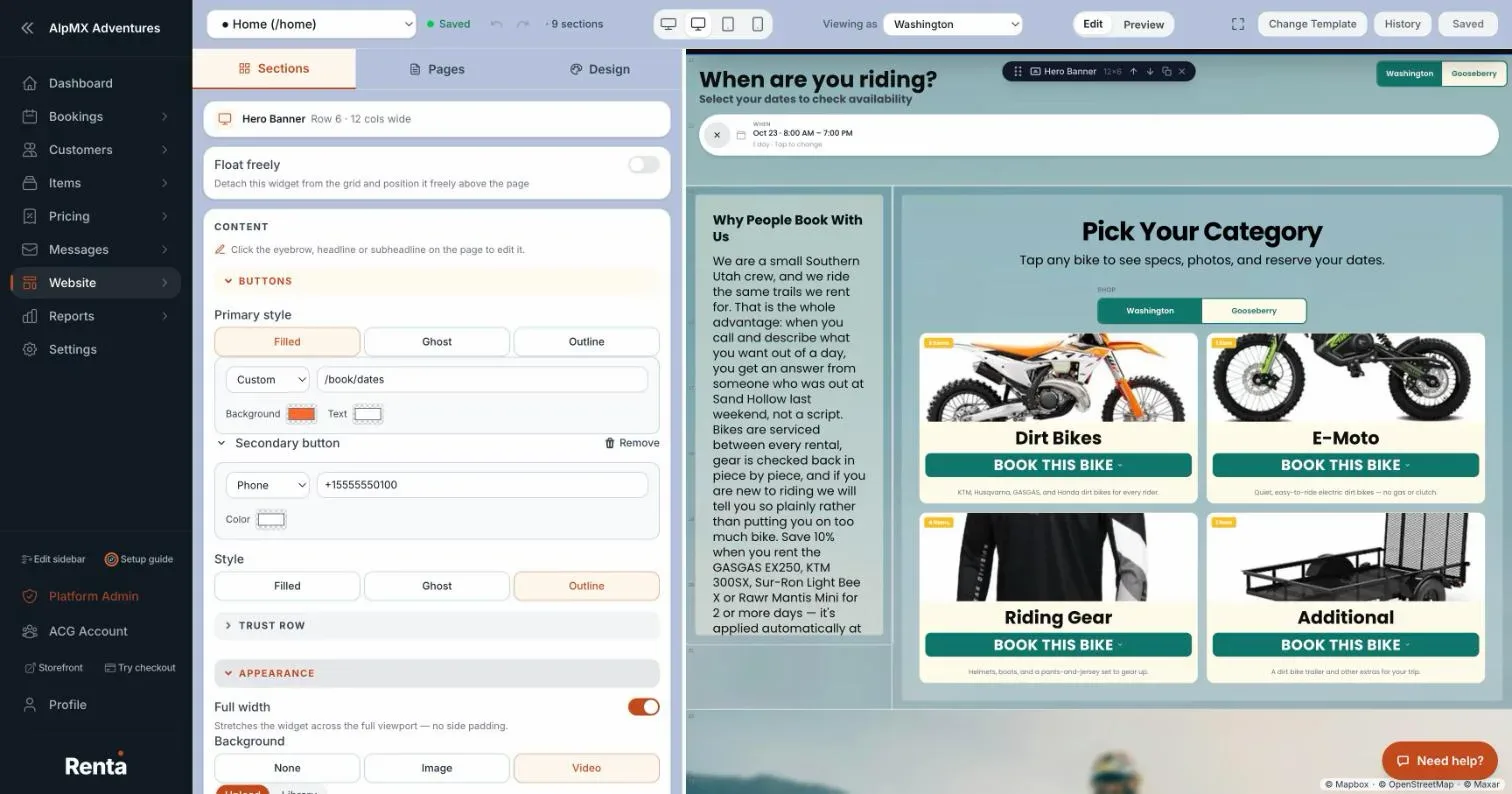 The Hero widget's settings panel, with the headline edited directly on the page and the panel holding buttons, trust row, background and layout
How it works
The words are edited on the page itself. The settings panel no longer has text boxes for them. Its Content section just says "Click the eyebrow, headline or subheadline on the page to edit it." Click the text on the canvas to select it (a floating toolbar appears with Font, Color, Size, alignment, weight and Reset), click again, and type. The change is saved when you click away. Both button labels work the same way: click the button on the canvas and type. An empty line shows a grey placeholder ("Eyebrow", "Headline", "Subheadline", "Button label") so you can still click it.
The panel keeps the settings that are not text, in these sections:
- Buttons: Primary style (Filled, Ghost or Outline), then a link picker for where the button goes (one of your pages, or Phone, Email, SMS or Custom) and its colors. Add secondary button opens a second button with its own link, colors and Style; Remove takes it away.
- Trust Row: small items under your text. + Add item, then choose Stars (with a rating and review count), Text, Badge, or Google (uses your live Google rating once Google is connected).
- Appearance: Full width (stretches the banner across the whole screen with no side padding), Background (None, Image or Video), and Glass. With None, the banner uses your brand gradient. An image has optional alt text. A video can have a poster image and optional Trim start and end seconds. Glass is a frosted layer over the background: a color swatch plus an opacity slider, where 0% hides it so your text stays readable on a busy photo.
- Advanced: Content position (a 3-by-3 grid for where the text block sits) and Sticky scroll effect (the background moves slightly slower than the page as visitors scroll; it takes effect on the live site, and works best when the widget is 6 or more rows tall).
Example
A jet ski rental business clicks the headline on the canvas and types "Ride the Lake Today". In Appearance it sets Background to Video, then clicks the button on the canvas, types "Check Availability", and picks its booking page in the Buttons link picker.
Good to know
- You choose one background at a time: None, Image or Video. A poster image shows while a video loads.
- The hero spans the full width of the page only when Full width is on.
- Colors you don't explicitly set here fall back to your site's theme, see Setting your site-wide colors, fonts and spacing.
Related articles
- Website widgets — common questionsQuick answers on adding and setting up each website block (hero banner, fleet grid, photo gallery, Book Now button, contact map, reviews, FAQ, navbar, footer and more), and why a block may look empty on your live site.
- Website AI assistantTurn on Renta's own chat assistant for your public website. It answers customer questions from your live rentals, prices and availability, and is paid for with AI credits.
- Reviews and FAQ widgetsShow your customer reviews in a list, grid or carousel, and answer common questions in a collapsible FAQ list.
- Text blocks and image galleriesA Text Block widget for writing rich content, and an Image Gallery widget for showing off photos.
- Navigation bar and footer widgetsThe site-wide header with your logo and menu links, and the footer with contact info and social links.
Still stuck? Ask the chat.
Was this helpful?